Image powered by Unsplash
A well-designed architectural elevation is an effective way to improve the quality of urban design, landscape and public realm. It is the immediate instrument to attract people to the neighborhoods.
There are 5 principles to help us start on a drawing board.
1. Context and Harmony
Harmony is the quality of forming a pleasing and consistent whole. More and more of recent architecture projects are urban infills. Therefore, a consideration of the surrounding buildings is important factor of designing the elevation.
Besides trying to fit in the existing context, the building needs to unify its various architectural elements in the elevation as well. Large elements like slab line, doors, windows or signage to small elements such as brick lintel, downspout, or vents; they all have to maintain certain alignment in order to create a kind of harmony. Other than basic alignment, using a similar element to construct an elevation also helps to create the harmony affect.
Here are two examples to explain this idea.
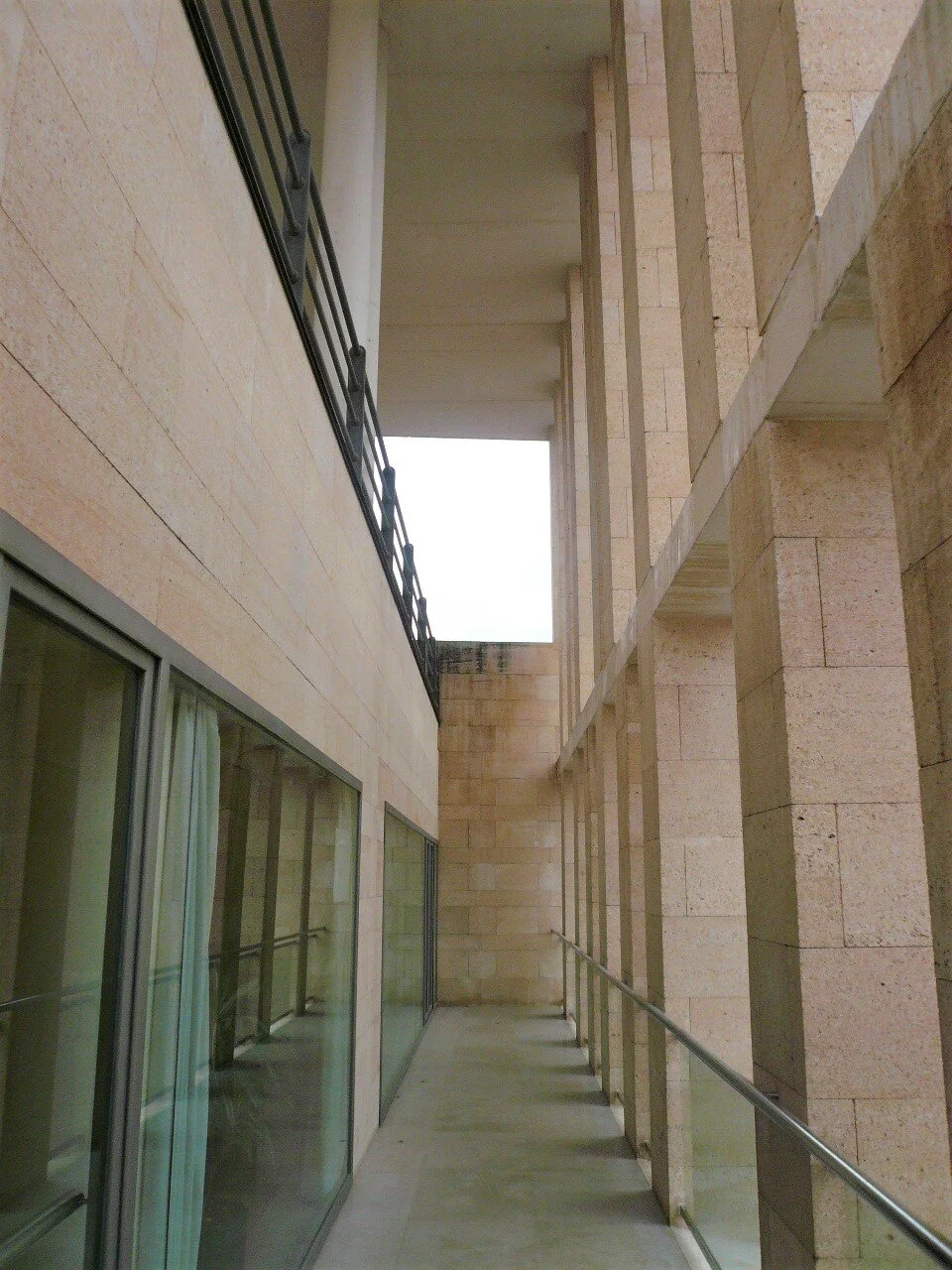
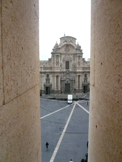
Murcia City Hall is situated at plaza of Cardenal Belluga, facing Cathedral of Santa Maria. The building intends to use ridged geometry to align with the adjacent existing buildings with emphasizing slab lines, array of columns, and classic proportioned openings to form harmonize with the context. The main composition of the loggia is also designed to respond to the distinct plaza pattern and the Cathedral at the other end of plaza (original image excerpt from Domusweb.it) In the gallery photos below, you can experience the importance of this corridor in between the double-layer facades: the first layer was connecting the town’s rich historic fabric, the second inner facade is connecting the fundamental occupants’ needs who use this building. The over-scaled loggia system also framed particular perspectives for visitors viewing the plaza, cathedral and its activities.

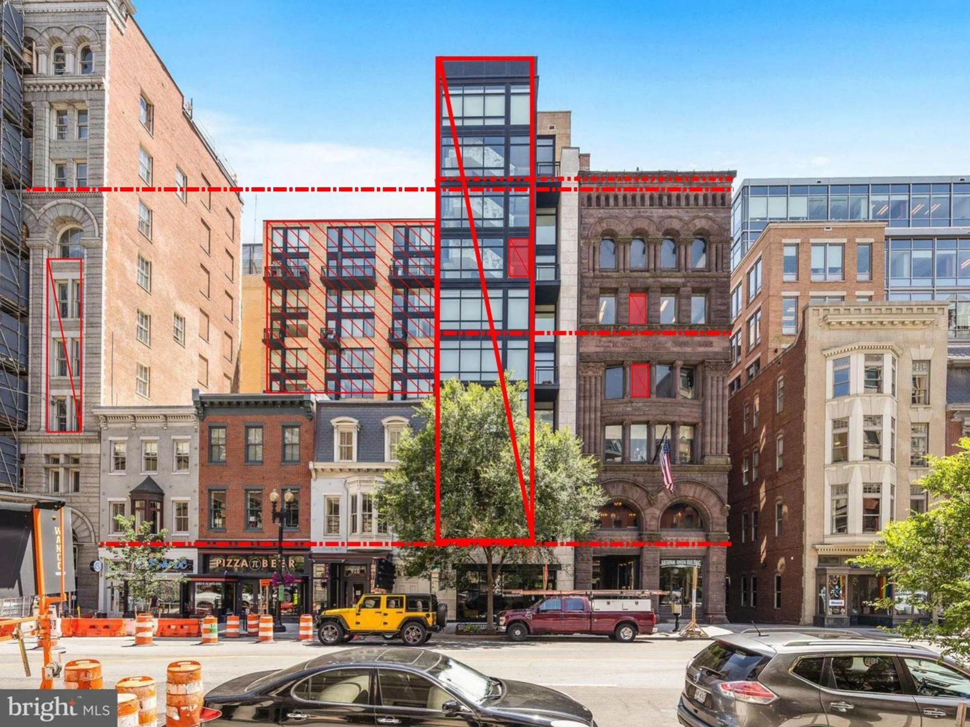
912 F street is a typical urban infill project. The front portion of the site is a narrow lot and in between the typical DC row houses and National Union Building, a Romanesque architecture. Though 912 F condo uses a modern, transparent tower to emphasize the entrance; yet, it keeps a solid ground floor and maintain the classic base datum to the adjacent buildings in order to create a consistent street front. The height of the entrance tower is to match National Union Building and set the main building back as a backdrop for the row houses along the street. The building use black window mullion to emphasize the proportion of the frame so the visitors can easily relate to its ratio to those opening of existing adjecent buildings.
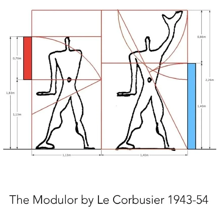
2. Mass and Proportion
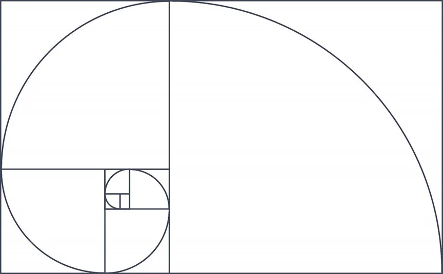
When we talk about architecture, we must talk about human scale and its related proportion. Ever since ancient Greece, those artists have already found the golden ratio, later the DaVinci’s anatomical study drawings influenced how people see spaces and use perspectives related to human body. As our eyes are so used to those specific proportion, we still apply the similar principle to design our spaces and buildings till modern days. Architect such as Le Corbusier, Richard Mires and Peter Eisenman’s early works are known for following this math in the elevation.
We also use mass to make statement towards the land we build. Frank Lloyd Wright’s Falling Water using horizontal mass to provide elongated vistas leading visitor’s eyes out to horizon and the woods. This calming horizontal mass also accentuates the vertical waterfall.

Image excerpt from Frank Lloyd Wright’s Foundation
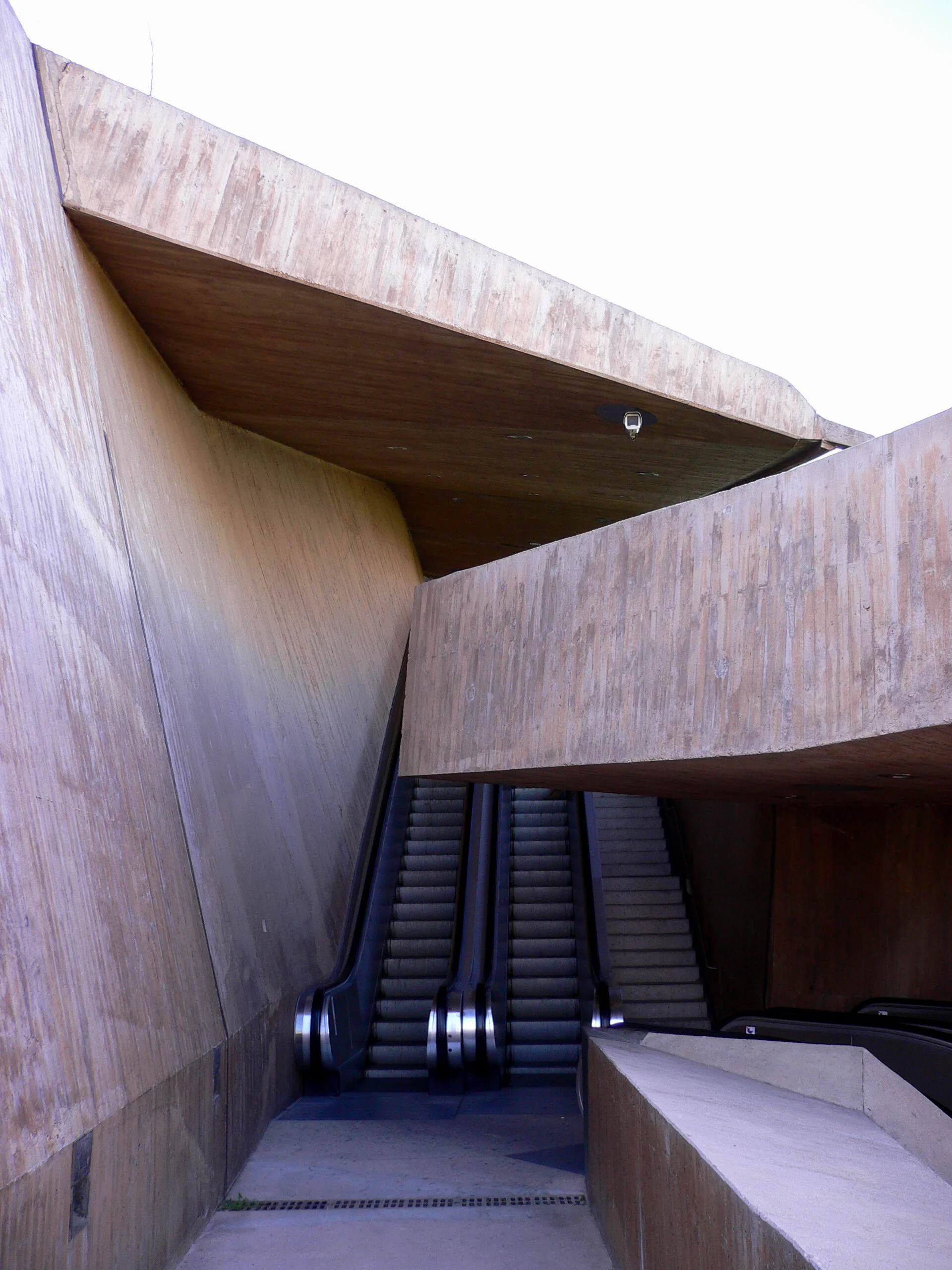
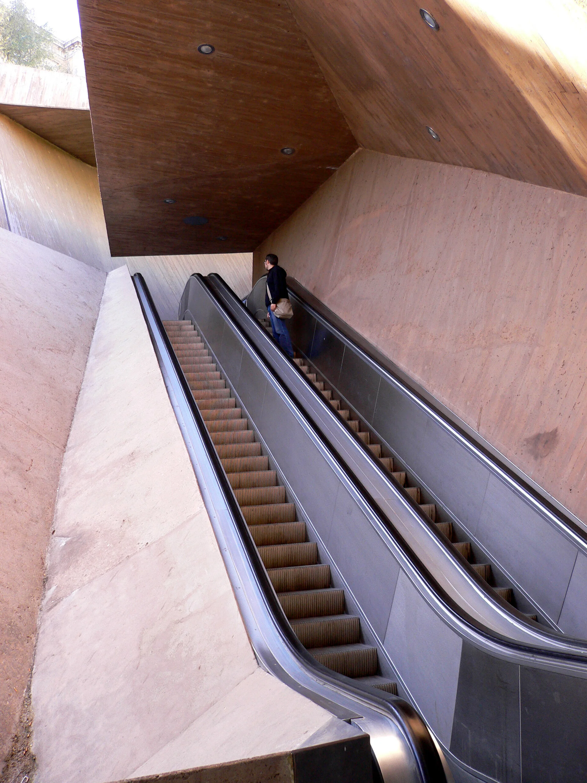
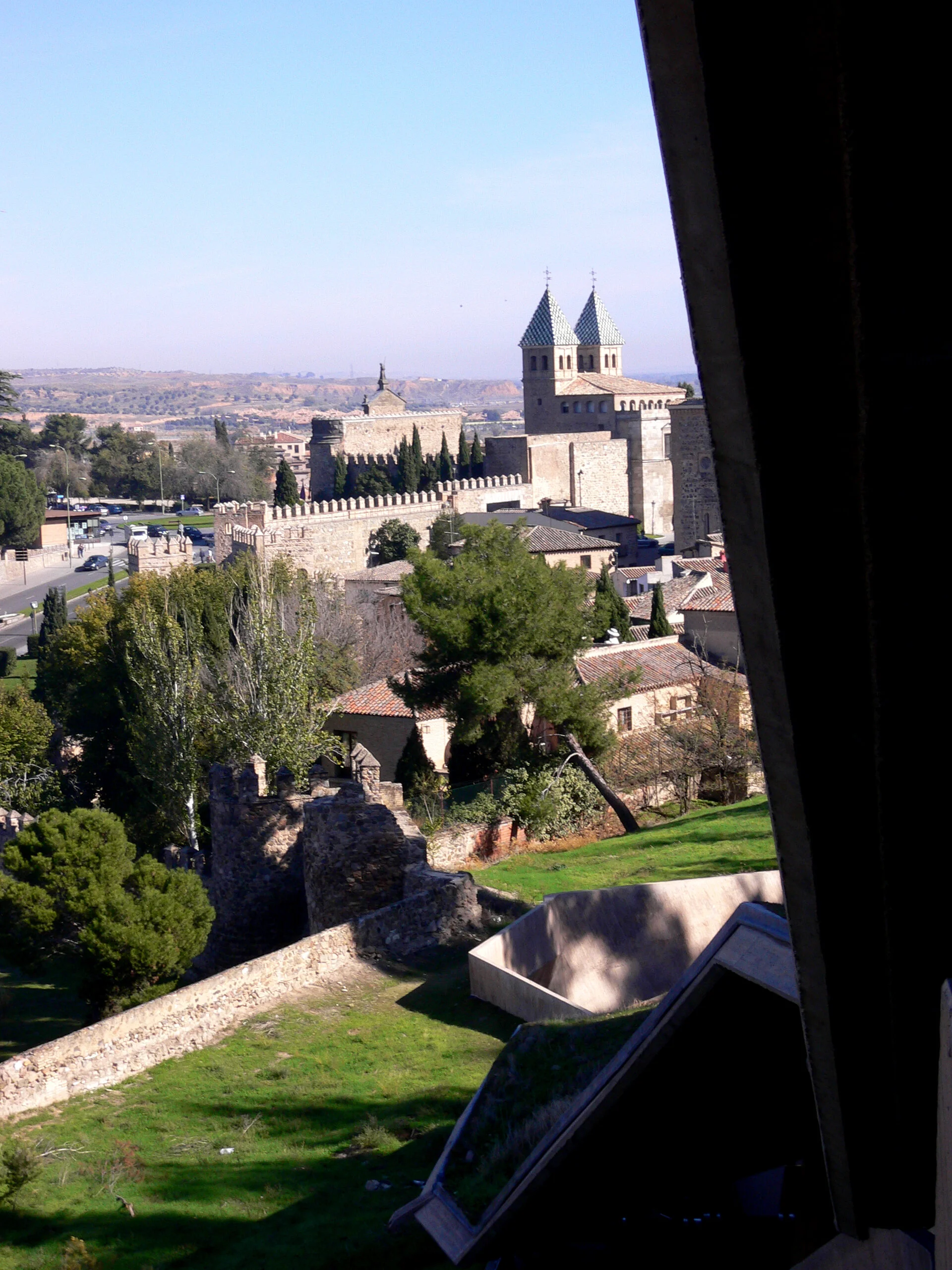
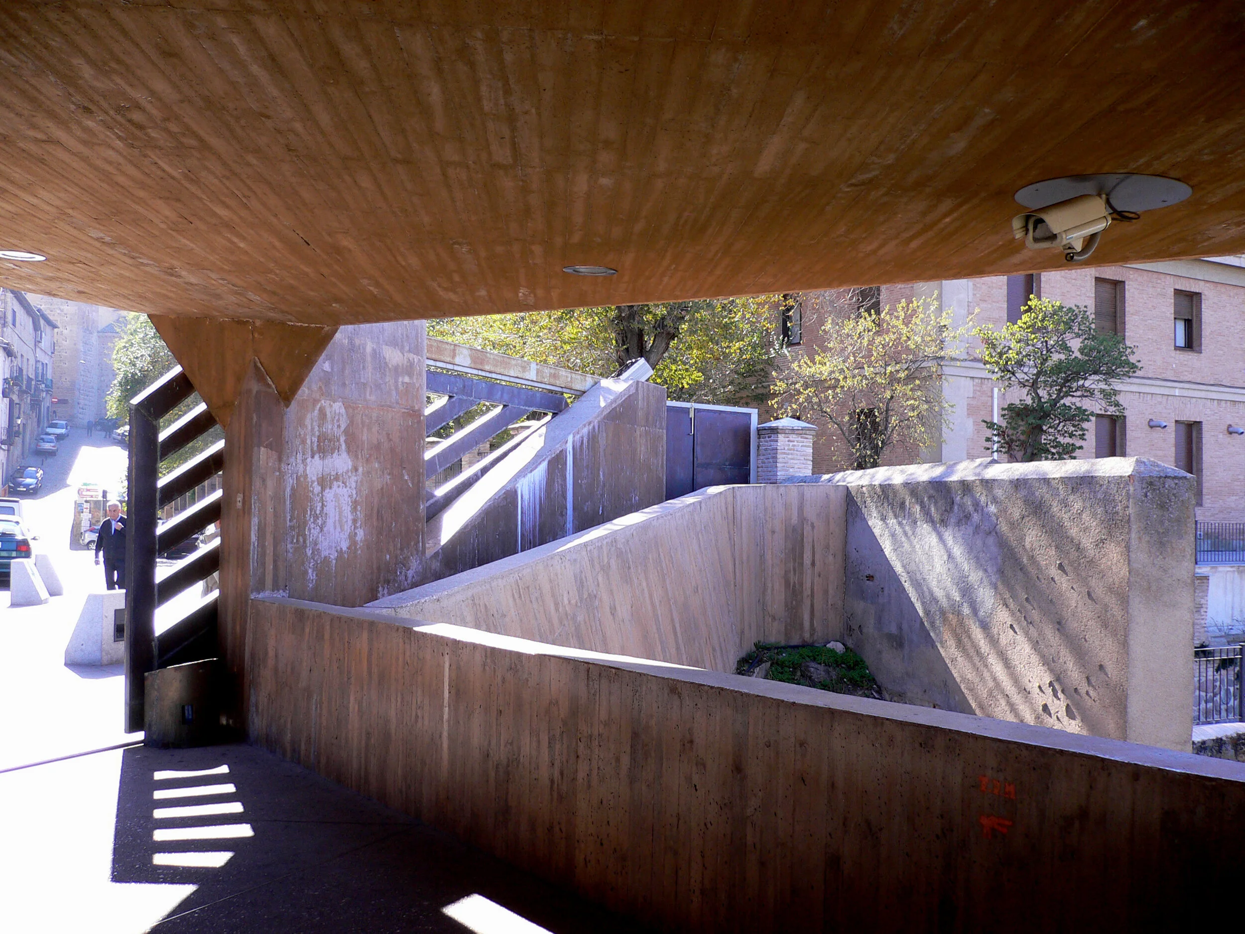
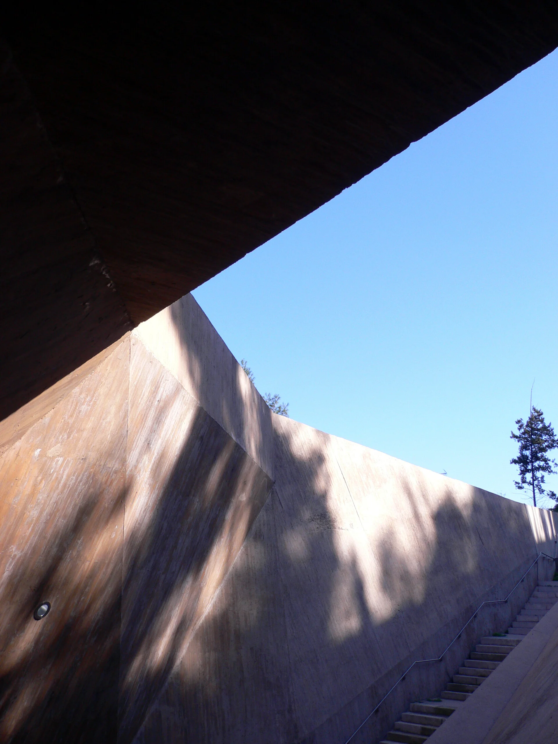
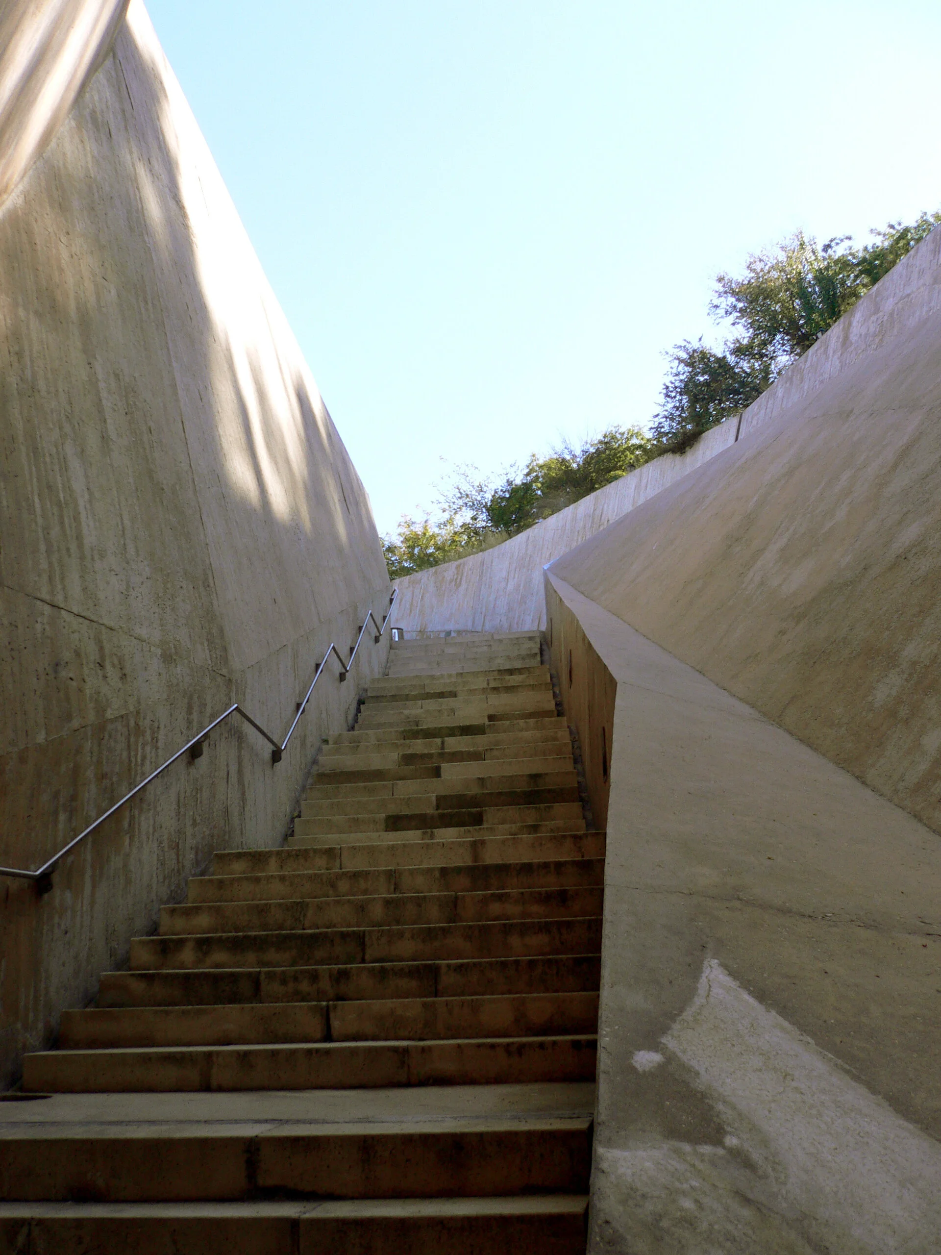
Stairs of La Granja is an escalator connect to Toledo’s visitor center designed by Elias Torres. This project consists of six flights of stairs, rises about 95 feet, and forms a zigzag figure embedded in the hillside to reduce the visual and environmental impact. This opening, observed from a distance, becomes the most characteristic element of the project: a crack, a lining of light during the evening.
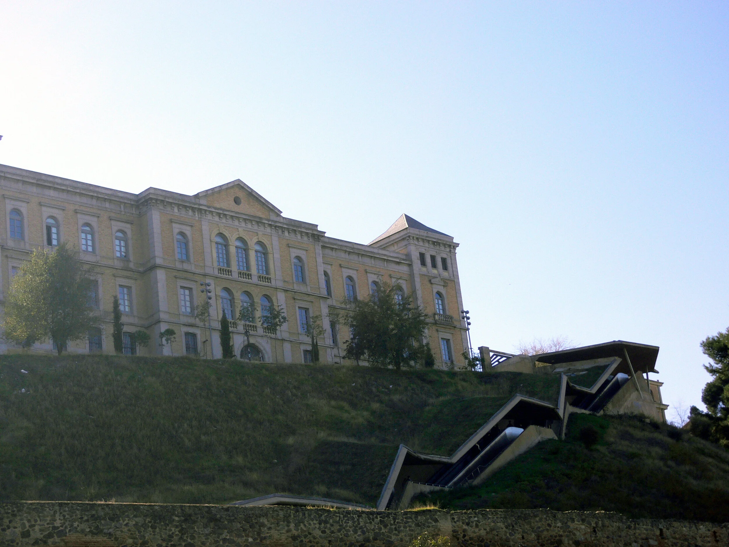
Photo credit: author